State of Decay #8 (May 2025): Small updates + The process of creating a character portrait.
A new month, a new State of Decay - It’s started to become a real habit, come about the 15th of the month and I’m itching to write the next one; usually I have to hold off until at least the 20th before writing most of it. Well as of writing it’s the 21st right now, and I have more than enough done this month to write something, in fact, the main feature of this blog post was already done by the 11th!
Anyway, remember when I wrote “I really hope I’ll stop being ill and, come this time next month, I’ll be bragging about how I’ve knocked out a bunch of stuff.”? Well, I’m still ill, but (if you couldn’t already tell) there’s lots to brag about; although I won't elaborate any more than I usually do though. The last month has been the first month of the year where I worked on Toparo for at least an hour most days, which is my general target; more would be nice, but an hour most days means this thing will be done (hopefully) sooner rather than later.
Starting off: I finished all of the bullet sprites! After a few months of being lazy I forced myself to finish them and let me tell you, there was *way* more still to do than I realised, still did them in about five days though (^^; You can find the full (already slightly outdated) image on my Twitter/Bluesky, not posting it here because of how massive it is. Then, I made one piece of music - Now, I think I’ve said this before but, even though I *really* should be averaging four tracks a minimum per month - I hate making music, so any progress is good enough for me (please ignore the fact that said piece of music is only 1 minute long, please).
After that, about halfway through the month, I did something a bit odd, I wrote the first chapter of a new story! Yes, as much as it seems I’ve forgotten about that section of the website, I haven't, it’s just that it’s kind of hard to write much of anything when, not only are there more important things right now (like, you know, making the video game?). But it’s also the fact that it would have to make sense on its own since well… the game that any story would relate to isn’t out (did I mention the fact that the *videogame* isn’t out yet?) I tried thinking of a few things related to the game that would kind of sort of make sense on their own and came up blank, then I had the brilliant idea of just making something stand alone that has nothing to do with the first game. Now, I’ve wrote the first chapter in its entirety (and I’m *very* happy with it) but I’d want to write a few more, just to make sure it wasn’t a fluke before I commit to it. The story itself? I won't say much for now, but it’s the sort of thing where each chapter is kind of its own thing; I quite enjoyed magicing up a small cast of characters on the spot just before I started work on it.
Next is the thing relating to the main focus of this SoD. I started a decent effort in working on the character portraits again! Yeah, that time I started around October I only ended up doing a couple, but this time I’ve done quite a few; still nowhere near done (and I wont be for a few months at minimum) but a start’s a start.There’s overall 69 of them to do (yes really, the funny number was pure coincidence) and as of writing I’ve completely finished… sixteen and there’s six more unshaded, so there’s a little way to go (^^; But hey, only two more (I think) until all the demo 0 ones are done!
Anyway, haven’t you ever wondered what my general process for making a character portrait sort of looks like?
...
N-No..? Um, well too bad! Here it is:
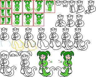
First thing first is the job of getting that outline done, now before this step, I’ll usually draw a couple quick (ie: twenty second) sketches on actual paper first to get a general idea of the kind of pose I’m going for, or to just get some reference images of the character at different angles/ bizarre poses. Then it’s time to get on MS Paint to do the rest of the work, no tracing/digitising paper sketches here, it’s a faff and makes getting everyone to be vaguely in proportion with each other a nightmare. First things first is to get the character’s unshaded boss/player sprites as an immediate reference point, that’s what you see in the top left; this character also has another appearance later in the game with a different outfit, so that’s there as an extra reference (mostly because the main outfit hides the waistline, but it’s also important to make sure both end up consistent with each other).
So many words and there hasn’t been any real drawing yet… The first (and most important) thing to do is draw the face, not only is it by far the best point to start drawing everything else from, it’s also the thing that decides the scale of the entire portrait, so I spend a while just on the face to make sure it’s the correct size compared to everyone else. Next it’s time to draw the thing hiding the neck, you'll notice that almost every character has something in the way of their neck, and that’s completely intentional; I hate drawing necks, hate looking at them too, of course I can’t just plop the head on the shoulders and call it a day, there has to be at least a *small* gap, otherwise it looks weird. Then it’s the waistline and main torso, another thing that’s important for getting the scale right; I draw the top of the waist first and then compare the difference from that to the bottom of the eyes against every other character to make sure everyone’s about the right height. It should be noted that particularly tall characters get most of their height from having very long legs. This one here is just below average height, but the complete lack of legs means that the torso ends up just a touch longer to compensate. How much the torso is *angled* is also important (obviously), not only because harsher angles will make the waistline rise a bit, but because the angle of the torso heavily influences the overall pose.
Speaking of the pose, next are the arms. Now, there’s a lot of intermediate steps here that didn’t get preserved as backups, but the first thing to do is make a rough (and I *mean* rough) sketch in a different colour. I’ll finagle and redraw it over and over until the general shape and size are right, it doesn’t have to be good, but it has to be a decent guide to draw over in black. As a general point: the arms should be a bit on the short size, it’s not that I can’t be bothered to proportion them right, it’s just that I think long and gangly vaguely realistically long arms don’t look cute enough, long legs are fine though (perhaps even preferable). You’ll notice that there are a few different incarnations of the arms here, that’s simply because I struggled to make my original idea work properly; not only did they look kind of off, but it also didn’t quite fit the “””vibe””” I was trying to convey, not to mention that this is the stage one boss of all four routes, so it’s probably a good idea to go with something safe. I ended up going with a sort of crossed arms look - It’s purely coincidental that it means I hardly had to draw her right arm/hand, honest.
Now’s about the time I should mention what’s up with the hands. As a *general* rule, at least one hand should look vaguely like a hand, the other can be a blob that’s only sort of in the shape of a hand; although here, the blob hand looks just fine because of what it’s doing, but that generally doesn’t happen. Alternatively, the would be blob hand could just be covered/heavily obscured by something, usually just put behind the character’s back. Again, it’s not that I can’t be bothered to make both hands look like hands, I just think it’s cuter this way; also, the overall artstyle is supposed to look very amateurish, not bad, just amateurish - I can draw far, *far* better than this, now, I don’t mean to sound like an ass, but I took art in both high school and college, and I’m not half bad; ie: I can draw significantly better than this! But I *intentionally* draw the art in Toparo like this for a few reasons; the most relevant one here is that this standard of quality is easily repeatable (to ensure a mostly consistent style) and that I can draw it at said quality decently quickly; remember when I said I had 69 of these to draw? If each one was something I spent ages on, I’d never be able to do anything else; and this game is already taking way longer than it should be.
Er, where was I? Oh right, after the arms it’s usually time to do the legs/dress, or in this case, the ghostly spirit half. You can see the rough sketches I was talking about with the arms here, for really anything large, it should be sketched first and then once again compared to other characters to ensure a somewhat consistent scale; it’s far easier to adjust a messy sketch you won't even keep instead of nice linework you spent time on. A thing to note when it comes to keeping a consistent scale is that particularly small characters end up a bit bigger than they should, while particularly large characters end up a bit smaller than they should; significant outliers on either end are the ones who end up noticeably bigger/smaller than they really should be. Anyway, it’s sort of the same idea as the arms, getting a bit noodly is fine as long as there’s only one major bend but I usually end up making the legs slightly more angular than the arms, of course here that’s all irrelevant considering there aren’t any legs to speak of.
Another thing you might notice is that the portrait has some extra details compared to the boss sprite, specifically the one pixel thick lines at the sleeves and bottom of the dress thing. These just come about as I’m making the portrait, I end up adding little things that are too small to be reasonably seen on the boss/player sprite; I think I initially started doing it for one character who had a very large area of one solid colour, but now it’s just become a thing everyone gets. Once that’s done, it’s time to go back and do the hair. I usually do the hair last but sometimes it makes sense to do it earlier, especially if the character has a large/notable hat, but it’s usually best left for the end. Sometimes it’s hard to make the hair not look like a big blob, but it only takes a bit of messing to make it look good enough.
Now, after all that work on getting the outline done, it’s time to add colour, but not before making the edit for the character facing the other way! Now, the amount of time this takes varies greatly, here it was just a few seconds moving the buttons on the shirt over, characters with asymmetrical designs may take longer and need bigger edits; characters that are *significantly* asymmetrical may require having both portraits be made simultaneously, or making one “neutral” portrait to then edit into both versions. You’ll notice that the hands used for the crossed arms swapped, that’s fine, asymmetrical *poses* are fine but anything else (such as handedness) isn't. I do this because it really bugs me when things like handedness swap; it also could create confusion on what the “correct” version is, which I don’t want. However, the main reason is that both versions get completely different shading anyway, so there’s no point in not doing this as well. It would save a lot of time if the shading got flipped but flipping the shading looks so horrendously bad considering how few colours there are, also it looks lazy - I don’t like looking *that* lazy.
Enough talk about the shading, it’s time to actually do it. This is what takes the portrait from looking awful to something a bit less ugly (assuming you like dithering).
Now, I can’t really describe *how* I go about dithering, it’s something I’ve developed over a decent while, and it’s still changing a little; but what I can do is show you how I do it.
The only thing I can say is that I try to avoid large areas of clean/consistent dithering, I like it looking a bit messy and inconsistent, it gives the art a nice texture and it certainly makes the limited amount of colours go just that bit further.
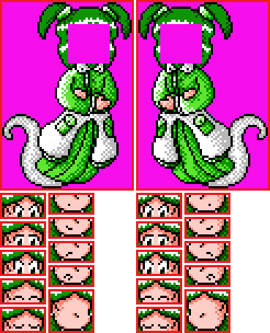
Then it’s time for the homestretch, getting the art ready to be imported. Including making the different expressions. This is done quite simply by removing the face from the portrait, drawing a version without facial features (where some small adjustments might be made to the shading on the face), and then splitting it in two and then actually making the expressions. Each character gets four mouths: neutral, smile, frown, open. As well as five eyes: neutral, lower, upper, closed up, closed down. Of note is that characters with glasses get two sets, one with and one without glasses, they also have the nose included in the sprites for the eyes rather than the mouth because the frames often overlap with the nose.
Wow, that took a while to write, I can tell you it took longer to draw though :P I know nobody really cares about any of that, but who knows? Maybe one day if someone (for whatever reason) wants to try and draw in this style, this might prove to be a handy resource??? I doubt that will ever happen though. What matters is that I had fun writing it.
Anyway… Next month? Hmm… Hopefully more of the same, I’d like to write at least two more chapters of that story before I post any of it. Otherwise I don’t have any particular goals right now; I guess I’m mostly focused on assets that would be used in demo 0, I really want to try and release that for September - As it stands, that certainly looks possible assuming I can keep up my current rate of work.
Also, here’s just a little thing I’m ramming onto the end of this about a week after writing the rest of this post:
In terms of bullet sprites and music, I’m looking into ways of heavily reducing the required filespace for both. For the bullet sprites I’ve been contemplating using a shader that changes colour pallets, this is mostly because the sheer number of bullet sprites would take up not only a lot of filespace but also potentially multiple texture sheets, both of which are better avoided (filespace is obvious, less texture sheets improve performance and generally reduce headaches). It would also be nice for other sprites like the player sprites, like player two having different colours in VS mode for example, right now that would have the same issues as the bullet sprites but worse because of the character portraits and such. The other file saving measure: the music. It’s far *far* more lucrative in terms of file size saving - Instead of having 90% of the games’ files be music it would be so much better if I could use the raw nsf (Nintendo Sound Format) data instead. Turns out someone seems to have made something for GameMaker that does exactly this! This one thing would take the music data from potentially about half a gigabyte down to just a few hundred bytes!
For comparison, here’s the breakdown of the stage 1 boss’ music in the four formats I’ve considered:
.wav (Perfect quality) = 9,174Kb / 0.009Gb~
.mp3 (Decent quality) = 2,497Kb / 0.002Gb~
.mp3 (Low quality) = 1,249Kb / 0.001Gb~
.nsf (Perfect quality) = 15Kb / 0.000015Gb~
(Note: A lot of this 15kb are the DPCM samples, which every piece of music in the nsf file would share; this track uses 6kb~ of DPCM, so it’s really only 9kb).
A truly insane saving that your hard drive will thank you for! (Assuming I end up going this route, I really hope this’ll work out, for both your sake and mine!) If I can, I’ll even try to do this with the sound effects, maybe…
...
This month’s crystal ball grazing: Misfortune follows all, some more than others. Regardless, if you were to become friends with your misfortune, perhaps it will become friends with you too.