State of Decay #5 (February 2025): Update to widescreen, a look at the new HUD.
Is it really February already? Ew… Well, January is always unpleasant - this year was a bit more on the worse side for me, between being decently ill for a week and having my fingers hurt all month it very much could have been better. Who cares about all the complaining, the only thing about it that matters is that I didn’t get much of anything done unfortunately; I guess I lied about only being lazy in the blog post last month (^^;
So, out of the very, very little work that *was* done this month, thankfully there’s at least one thing to talk about; the game’s in widescreen now (or well, it will be, haven’t implemented it yet, haha). This is mostly due to the fact that I’ve tried making a few mock-ups of VS mode which has revealed to me that screen real estate is at an extreme premium when you have to give two players even half of the normal playfield each. So why not just bite the bullet and make the whole game 16:9? I was mostly sticking to 4:3 out of stubbornness; the extra screen space means I can put all of the otherwise hidden information on display for the player.
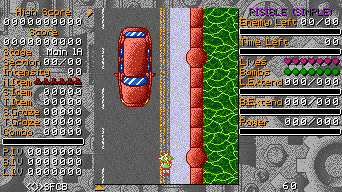
It’s a bit intimidating at first glance I think, with the grid of numbers on the left and six whole bars, but most of it is stuff that you don’t *really* need to know; part of the reason I was fine with not having all this stuff on the HUD in the first place. Honestly, I quite like how much stuff there is compared to the average Touhou game, ought to make a first impression, whether it’s a good or bad one doesn't really matter as long as there’s a first impression to begin with as far as I’m concerned.
Anyway, in the spirit of all the other blog posts where I was grasping at straws for how to make it longer than a paragraph or two (almost all of them so far), I’ll explain the whole thing in a sort of list format. Don’t fix what isn’t broke I guess…
High Score: Exactly what you think it is. I was contemplating having “High Score” and “Score” on either side of the playfield, but the two sides aren’t equal in size; this is because I wanted all the bars on the right to be exactly 100 pixels wide so 1% = 1px, the combo bar is fine being shorter because it’s constantly draining/empty so getting a clean percentage isn’t important.
Score: Exactly what you think it is. I also considered having “Score” change to “High Score” once it *is* a high score, meaning there’d only be one on screen, not both. I decided against it because it not only looked weird, but mostly because it wasn’t necessary as I didn’t end up running out of room on the left which was the whole reason I considered it in the first place.
Stage: Shows what the current stage being played is, for example, playing the first stage of route A in the main story would make “Main 1A” or something like that. Added mostly as an aid for figuring out exactly what part of the game any screenshot/clip is taking place in; it’s also a companion for the next piece of the HUD, which makes that niche use even more useful.
Section: Shows what the current section of the stage being played is on, counts from one and goes up. Exists for the same reason as “Stage” this one specifically will make identifying specific parts of the game even easier (think of strategy discussion in the description of a YouTube video, no more: oh you know, that one part *after* the midboss but *before* that trio of fairies). Also, it should make bug reports that include a screenshot/video far easier to find and fix (^^;
Intensity: Shows how much faster some bullets will be then normal. In other games this is called “Rank” which I changed because I’ve seen people confuse “Rank” for “Difficulty” before, I think “Intensity” should sound more distinct; starts at zero and goes up to twenty, select bullets get faster with higher rank. Having the rank always visible should help people realise it even exists. I’ll probably add some sort of “always max intensity mode” to make the game a touch harder for people who think it’s too easy, seems like a simple add.
N.Item (Next Item): A gauge showing the next six items that enemies will drop, the one with the yellow underline is the next one, red means a power item, blue a point item and red/blue means it’s a random 50/50 between the two. If this sounds similar it’s because it’s directly based on (ie: copied) from Touhou 2. It’s a short repeating list that decides the next enemy drop that appears to be random but ensures that you don’t just get power items or vice versa. It’s the exact same as the one from that game but the drops that give a random one don’t have a really small chance of giving a bomb - I think that’s just a bit silly.
S.Item (Stage Items): Amount of point items collected in this stage. Gives you an idea of how well you’re doing on getting life extends on a per stage basis. I guess it’ll let any math nerds have some fun trying to calculate part of the end of stage bonuses?
T.Item (Total Items): Amount of point items collected over the whole game. Entirely so you can figure out how many extends you got over the course of the game. I’ll be honest, these two are only here because it felt odd to not have them considering how much other information is on the screen. Even score players don’t really need to know this, just collect as many as you can!
S.Graze (Stage Graze): Amount of graze earned in this stage. Same deal as “S.Item” but replace “life extends” with “bomb extends” no need to write the same paragraph twice.
T.Graze (Total Graze): Amount of graze earned over the whole game. Ditto as above… I guess this is the only number in the HUD which I’m afraid might max out, oh well, it’ll only reduce one of the end of game bonuses if that happens; you’ll still get points from each graze after the max out so it’s fine.
Combo (Number and Bar): The number shows the length of the current combo and the bar shows how close the current combo is to running out. The current combo increases with basically every positive interaction, some will instantly max the bar out while others will only increase it a little. Once the combo ends, you get its value multiplied by… some number, I’ll decide that later after some playtesting (^^; It’ll probably be something like 10,000~? Not sure, the multiplier would have to get bigger as the combo increases to make sure that, for example, a combo of 100 is more valuable than 100 combos of 1. Both the combo bar and the N.Item gauge move in the opposite order to the one’s on the right side so your eyes don’t have to move as much to keep track of them.
P.I.V (Point Item Value): This is the value that point items give once you collect them. Basically any positive interaction will increase the value while negative one’s will reduce the value. This is another one that doesn’t really need to be visible, if you care about score, just do stuff that makes the number bigger; you can see the value when you collect point items anyway, even if it is quite brief.
B.I.V (Bullet Item Value): This is the value that bullet cancel items give once you collect them. The best way to increase this is to collect bullet cancel items en masse in a short period of time as the value decays very quickly; find a lucrative boss pattern and dump as many bombs as possible right on top of it, that’ll probably be the best source of score in the whole game. Again, doesn’t really need to be visible, again again, you can see the value briefly anyway.
L.I.V. (Laser Item Value): Same as “B.I.V” but doesn’t increase as much and only from laser cancel items, entirely because a solid laser would completely dwarf any other source of bullet cancel items; Although it’s still probably better if something is shooting more than 3 or so consistent laser streams.
RISIBLE (SIMPLE) (Difficulty Display): Shows what difficulty the game is being played in, “(Simple)” is added onto the end if Simple Mode is being played. Very self explanatory, no reason not to show it, many reasons it should be on display.
Enemy Left (Number and Bar): During a stage the number represents how many enemies have been defeated out of how many are required to complete the current section; the bar is a visual representation of this information. During a boss the number represents how many spell cards have been cleared out of how many there are in the fight; the bar shows the health left of the current spell card. Probably the one thing on the HUD that’ll be looked at the most, so important that the bar changes colour as it hits certain percentages so you can see your progress out of the corner of your eye; especially important in the stage for what should be obvious reasons.
Time Left (Number and Bar): The number shows how many seconds are left until the current stage section/spell card times out; the bar is a visual representation of this. If the number of seconds left is over 99, it’ll just show as 99. The old 4:3 HUD only showed the number, but with more screen space there’s no reason not to show an infinitely more helpful bar. There’s also sound effects that play on each of the last few seconds, if the bar and number weren’t enough for you.
Lives: Number of lives left, get hit when the gauge is empty and you’ll get a Game Over. Self explanatory, the number of lives you see is the maximum you can hold, get anymore and they’ll turn into bombs.
Bombs: Number of bombs left. Also self explanatory, the number of bombs you see is the maximum you can hold, get anymore and they’ll turn into a decent sum of points. Amount of bombs resets on losing a life back to default, when you’re on your last life, you get a few more bombs.
L.Extend (Life Extend) (Number and Bar): The number shows how many point items have been collected out of how many are required to get a life extend; the bar is a visual representation of this. As it currently stands, you only need 100 point items for each life extend but I think it’ll work more like Touhou 7 in the final game where the value rises with each life extend earned; not sure though, I’d have to have a decent bit of the game done to decide between the two systems.
B.Extend (Bomb Extend) (Number and Bar): The number shows how graze has been collected out of how much is required to get a bomb extend; the bar is a visual representation of this. Again, I’m not sure about how exactly this’ll work quite yet, right now I think it’s 200 graze per bomb, but that might be way too low - as much as I *want* people to actually use bombs frequently, I also want to make sure they have to dodge stuff sometimes too…
Power (Number and Bar): The number shows how many power items have been collected out of 100; the bar is a visual representation of this. In this game, power is just a damage multiplier, so once again, having this information on the HUD isn’t too important; even if it wasn’t a damage multiplier, it would be pretty obvious what level of power you have anyway. It would probably feel weird to not have this here regardless.
P.O.C (Point of Collection) (The arrow on the side of the playfield): This is the horizontal point at which items on the screen will fly into the player instead of continuing to fall; it also doubles the value of point items collected using it. It starts off way higher than you’d expect, but defeating enemies lowers the arrow and the arrow only goes back up when the combo bar is empty; given enough enemies, you *could* get it all the way to the bottom of the playfield… probably.
P.O.B (Point of Boss) (The arrow at the bottom of the playfield): This is the vertical point at which the boss is; if there’s more than one boss at a time, then more will appear. I’m not sure what this thing is actually called in other games, does it have a name? I called it the P.O.B just to match with the other arrow that moves around the edge of the screen.
(Arrows)SFCB (Input Display): Shows the players current inputs; arrows are for directional inputs, “S” for the shoot button, “F” for the focus button, “C” for the change button (some shot types can be altered by this) and “B” for the bomb button. In the game entirely because I think it’s fun to look at, you can turn it off in the options if you think it’s stupid.
60 (FPS Display): Shows current Frames Per Second. I don’t know *why* this is in basically every Touhou game but it takes, like, five lines of code to add so why not, you can turn it off in the options if you (rightfully) think it’s stupid. Let’s hope it stays at 60, eh? (^^;
Wow, that took all of way too long to write. I hope that wasn’t too boring to read, I tried to add little fun bits of information here and there to keep you awake. Anyway, you’ll be proud of me for thinking of a really cool (and large) idea this month and deciding I won’t add it, I’m done with feature creep now; I’m mentioning this because it would have taken up that last bit of area on the HUD and it’s the sort of thing that *really* needs to be added to the game now as it’ll be a pain to add after I properly start making the actually playable part of the game. I do want to release this thing *before* I’m on my deathbed afterall…
Hopefully next month will be a lot better in terms of progress, no guarantee other than I’ll at least do a little here and there every few days at minimum. “Demo 0” eternally sits at “It’s only a month away! …assuming X, Y and Z were done a week ago.” if you’re curious.
Also, if you’re wondering, creating the widescreen version of the background image took all of half an hour, design’s a bit lopsided now, but it looks fine enough.
...
This month’s crystal ball grazing: Wait, wait… here we go. When you cross paths with a black cat… avoid it. That’s it..? Next time this thing fogs up I’m getting a new one…
...
Uh, hey, Impeli from 05/02/25 here! This blog post was late because I got really ill. Really nasty food poisoning from Jan 31st -> Feb 2nd followed by getting a really painful abscess on Feb 2nd -> ??? haha… It’s pretty bad but it’ll pass soon enough; I physically can’t use my laptop without being in great physical pain, typing this while awkwardly kneeling on a pillow propping the laptop up on the arm of a chair (^^;